Small Business Website Header Checklist
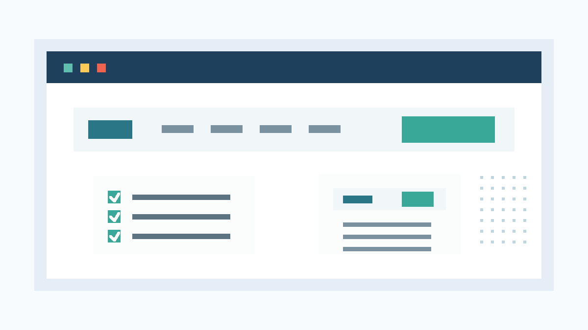
Your header has one job: help a visitor know what you do, trust you, and take the next step without hunting. Put your logo, plain navigation, one main action, a
Start with the action you want
Pick one main action before you touch the design. Most local businesses need one of these:
- Call now
- Book online
- Request a quote
- Schedule a consultation
- Get directions
Choose the action that matches how your customers buy. A med spa may need "Book appointment." A contractor may need "Get a quote." A cafe may need "View menu" or "Get directions."
Do not give five equal choices. Your header should guide the visitor toward the next step you want them to take.
Keep the logo clear and boring
Place the logo in the top left on desktop. Link it to the homepage. Use a version that stays readable on mobile.
Many small business sites use a logo file that looks fine on a sign but turns muddy at website size. If your logo has tiny text, thin lines, or a wide horizontal layout, use a simplified mark in the header and save the full version for the footer.
Your logo should identify the business. It does not need to carry the whole brand story.
Use menu labels customers understand
Your navigation should use plain labels:
- Home
- Services
- About
- Pricing
- Reviews
- Contact
Use the labels your customers would search for. "Solutions" sounds broad. "Services" tells a visitor where to click. "Connect" sounds soft. "Contact" tells them how to reach you.
Most small business websites only need four to six menu items. If the header needs a second row, the site needs a simpler structure.
Put one main button in the header
A header button should lead to the most valuable action. Use clear button text:
- Get a quote
- Book a call
- Schedule online
- Request service
- Start my website
Avoid weak labels like "Learn more" in the header. A visitor can learn from the page. The button should move them closer to becoming a lead.
If you sell fixed packages, send the button to pricing or contact. If you book appointments, send it to the booking embed. Patchwork includes booking embeds in every website tier, so service businesses can make this action visible without building a custom booking system.
Add contact details only when they help
Phone numbers belong in the header for businesses that close by phone: contractors, clinics, salons, repair shops, law firms, and home services. Restaurants, cafes, and local shops may need address or directions instead.
Use click-to-call formatting on mobile. Keep the number readable. Do not hide it inside a tiny icon if calls matter to your business.
If you serve a defined area, add the city or service region near the top of the page. A simple line like "Serving Cleveland and nearby suburbs" helps visitors self-qualify before they contact you.
Make the mobile header faster than the desktop header
Most local prospects will see your site on a phone. The mobile header needs less, not more.
A good mobile header usually includes:
- Logo
- Menu button
- Call or booking button
- Sticky behavior only if it does not cover the page
Test it with your thumb. Can you tap the call button? Can you open and close the menu? Can you read the labels without zooming?
If the mobile header eats a third of the screen, shrink it. Your visitor came for the service, price, location, or booking path.
Use trust cues with restraint
A header can carry one trust cue if it helps the decision:
- Licensed and insured
- Local ownership
- Open today
- Free estimates
- 5-star reviews
- Same-week appointments
Use a claim only if you can prove it. Do not write "trusted by hundreds" unless you have the proof. Do not show a rating unless it matches the public source.
One specific cue beats a pile of badges. Pick the cue that reduces the first objection.
Do not overload the top of the page
A crowded header makes a small business look harder to work with. Cut anything that does not help a visitor choose or act.
Common header clutter includes:
- Social icons before contact details
- Multiple buttons with equal weight
- Dropdowns with thin pages
- Taglines that repeat the hero headline
- Icons without labels
- Login links customers do not use
Social links can live in the footer. Secondary pages can live in the footer too. The header should move buyers, not catalog every page.
Match the header to the website tier
A five-page website does not need a giant menu. A simple Patchwork Launch site can use this structure:
| Header item | Recommended setup |
|---|---|
| Logo | Links to homepage |
| Navigation | Home, Services, About, Contact |
| Main action | Get a quote or Book online |
| Contact cue | Phone number, city, or service area |
A Grow site with a CMS may need a blog, announcements, or service updates. Even then, keep the header short. Put content-heavy links in the footer or on the homepage.
Custom sites can support deeper navigation, but only when the business has enough real content to justify it.
Header checklist before launch
Run this pass before the site goes live:
- The logo is readable on desktop and mobile.
- The logo links to the homepage.
- The menu uses plain labels.
- The menu has no dead pages.
- The main button uses action text.
- The main button points to the right page or booking embed.
- The phone number works on mobile.
- The service area appears where local visitors can see it.
- The mobile menu opens, closes, and scrolls without friction.
- The header does not block the page on small screens.
- Trust claims have proof.
- Social links do not distract from contact.
- The header looks consistent across every page.
- The footer carries secondary links the header does not need.
This pass catches the small mistakes that make a site feel unfinished.
What Patchwork handles
Patchwork Sites builds fixed-scope websites for small businesses that need a professional site without agency pricing. The Launch tier is $997 for up to five pages with no CMS. The Grow tier is $1,797 for up to seven pages plus Sanity CMS. Custom work gets scoped by quote.
Every tier includes a booking embed and stock imagery. You provide the copy and custom photos. If you need a clean header, simple navigation, and a clear contact path, start with Tier 1.
Need the site to grow with services, announcements, or posts? Pick Tier 2.
Frequently asked questions
How many links should a small business website header have?
Most small business headers need four to six links. Use the pages buyers need before they contact you: services, pricing when available, about, reviews, and contact.
Should my phone number be in the website header?
Put your phone number in the header if customers call before buying. Use click-to-call formatting on mobile. If bookings matter more than calls, use a booking button instead.
Should social media icons go in the header?
Usually no. Social icons can pull visitors away from your site before they contact you. Put them in the footer unless social proof drives the sale.
What should the main header button say?
Use action text tied to the sale: Get a quote, Book online, Schedule a call, or Request service. Avoid vague labels like Learn more.